CSS for Application UIs by Brian Beck
Introduction
So you’re wondering how to best push UI elements around on a page. Using CSS to style an application interface, as opposed to a conventional document, presents some hazards:
- Applications are far more dynamic than documents. UI elements move around, hide and reappear, and often animate depending on application state. Since elements in the flow of a page affect each other’s layout, far more care must be taken to give the right elements the right layout properties.
- There are many more judgement calls to make. Should I absolutely position all these elements, or let them flow? Should adjacent elements be floats, inline-blocks, or neither? Is the surrounding whitespace a margin, or padding? In a conventional document, many of these choices are obvious; in an application, they can seem arbitrary.
- There’s more pressure to obey exact pixel constraints. The majority of UI elements are of predefined width and height, unlike in a conventional document, where this is likely only the case for images. One UI element growing a single extra pixel could throw everything off by pushing adjacent elements onto a new line.
This guide will not make you a CSS expert, but it will hopefully give you a foundation and repeatable thought process for tackling application UIs.
Styling with intent will spare you (some) headaches
Since there are so many ways to position elements with CSS, and they all interact differently with surrounding pieces, it’s easy for an interface with many elements to become an unpredictable, unmaintainable mess. Sometimes there is no discernible reason why an element has been pushed this way or that by the layout engine. As authors turn to features like relative positioning in desperation, sometimes there is no discernible reason why an element has been pushed this way or that in the CSS code itself!
There’s a good way to avoid this mess, or at the very least, to make consistent, less arbitrary decisions. The idea is to use styling rules that match the intent of the design, rather than merely achieving an end result that is visually the same (no small feat in itself!). This requires one to consider the design in a more abstract way – one that is often never explicitly stated in mockups, or perhaps never even considered.
But why should you spend time sussing out the intent of a design, and reflecting that intent in the CSS you write? Because it makes your code more resilient when UI decisions are revisited, or when the application loads content of unanticipated length. Just because a mockup only contains copy that never wraps to a second line, that doesn’t mean you can avoid planning for it. When these things happen – and they will – you want to revisit as little of your CSS as possible.
Let’s see how styling with intent works in practice.
Example 1
Given a simple task, how might we arrive at a resilient solution, rather than just the quickest solution? What questions should we ask to determine the intent of the design?
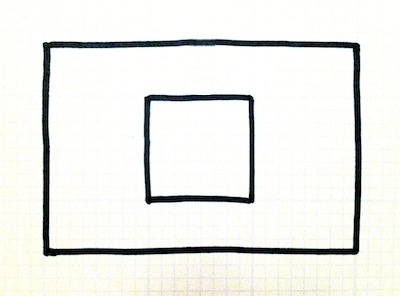
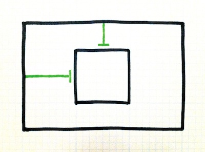
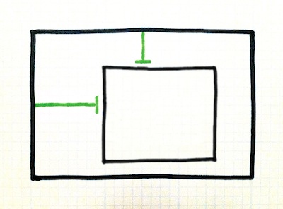
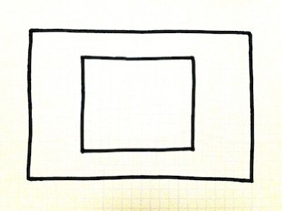
Suppose we need to position one box within another as pictured here. Both boxes have fixed dimensions. This should be simple enough, but we still have plenty to think about.
#outer {
  width: 300px;
  height: 200px;
}
#inner {
  width: 100px;
  height: 100px;
}
Specifying just the right amount of padding on the outer box will do the trick. To do this, we need to set the horizontal padding to half the difference between the element widths, and the vertical padding to half the difference between the element heights. For example:
#outer { padding: 50px 100px; }
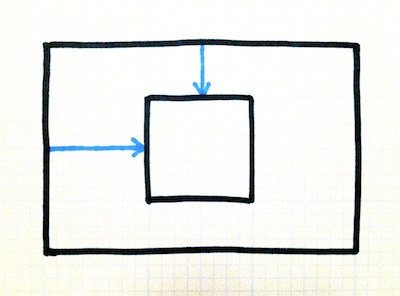
You might feel that the padding was a bit overspecified. Assuming the inner box is left and top aligned, we can achieve the same positioning without the right or bottom padding.
#outer {
  padding-top: 50px;
  padding-left: 100px;
}
Do we stop there? Not today! Let’s evaluate some alternative approaches. Instead of giving the outer box padding, we could instead give the inner box margins. (Let’s skip the step where we start with margins on all four sides.)
#inner {
  margin-top: 50px;
  margin-left: 100px;
}
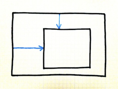
Explicit positioning is another alternative. We could relatively position the inner box, or absolutely position it within the outer box, like so:
#outer { position: relative; }
#inner {
  position: absolute;
  top: 50px;
  left: 100px;
}
Now, use your imagination
Which of these approaches best matches the intent of the design? Well, they all required us to plug pretty much the same values into our CSS. It’s hard to say that any one is better than the other.
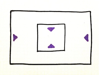
When faced with this situation, throw a wrench in the works! Tweak something in the design and see how the different options react. The solution that reacts most favorably is probably the most in line with the intent of the design.
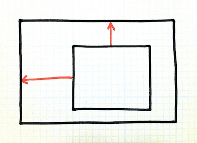
Let’s see what happens when we make the inner box bigger:
#inner {
  width: 150px;
  height: 125px;
}
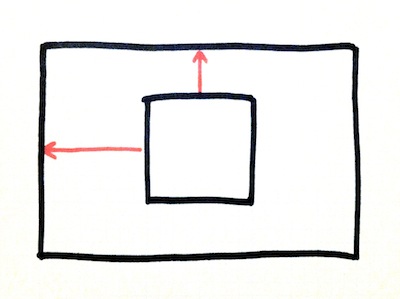
Hmmm, the padding is still the same, and it doesn’t look very good. We can already tell that the CSS we wrote was heavily dependent on the exact dimensions of the boxes.
Of course, the solution with margins produces an identical result.
As does the absolutely positioned solution. It looks like all three options would require us to go back and tweak the values we hardcoded in our CSS…
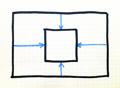
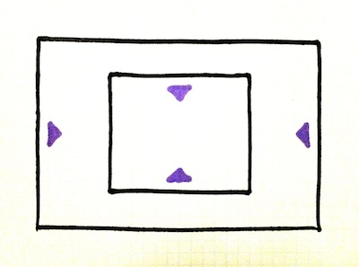
First let’s ask, what should it look like?
Is this what you had in mind? It sure looks “right” to me.
This is a good indication that we’ve hit on the intent of the design. It was never the intent to position the inner box a certain number of pixels from the edge all along! Rather, we can assume that the intent was to vertically and horizontally center the inner box within the outer box.
Let’s try a new approach altogether.
This time, we’ll use alignment properties instead of exact pixel offsets.
#outer {
  text-align: center;
  line-height: 200px;
}
#inner {
  display: inline-block;
  vertical-align: middle;
}
And when we throw the same wrench back in? It still works!
Now, the only situation in which we’ll need to revisit our CSS positioning is if one dimension changes: the height of the outer box. And we’ll only need to revisit one property: the line height.
You can see how this is more resilient.
Hopefully you now understand what it means to determine the intent of a design. As you get better at CSS, you’ll be able to perform these little experiments in your head, and weigh your options in a matter of seconds. More examples are forthcoming…
Quick exercises for determining intent
Pretend the element had a background color rather than being transparent. What should be the expanse of the colored box?
Useful for determining whether whitespace is intended to surround an element (margin, positioning) or live within it (padding, line-height).Pretend the element or its container changed size. How far should its new edges be from its surroundings?
Useful for deciding between margin, padding, positioning, and alignment.Pretend the text spanned two lines instead of one. What should be the spacing between the lines? How does the (now taller) span of text align with its surroundings?
Useful for deciding how much whitespace is line-height vs. padding when a mockup only shows one line of copy.Pretend the text adjacent to the element ran against it (from the left, for instance). Should the text wrap, truncate, or continue along the line? Should it overlay the element or disappear behind it? Should it push the element over to make room?
Useful for determining wrapping behavior, overflow, and float vs. absolute positioning.